Image Slider

Thoughts on: Sustainable Logos

On
Tuesday, September 4, 2018

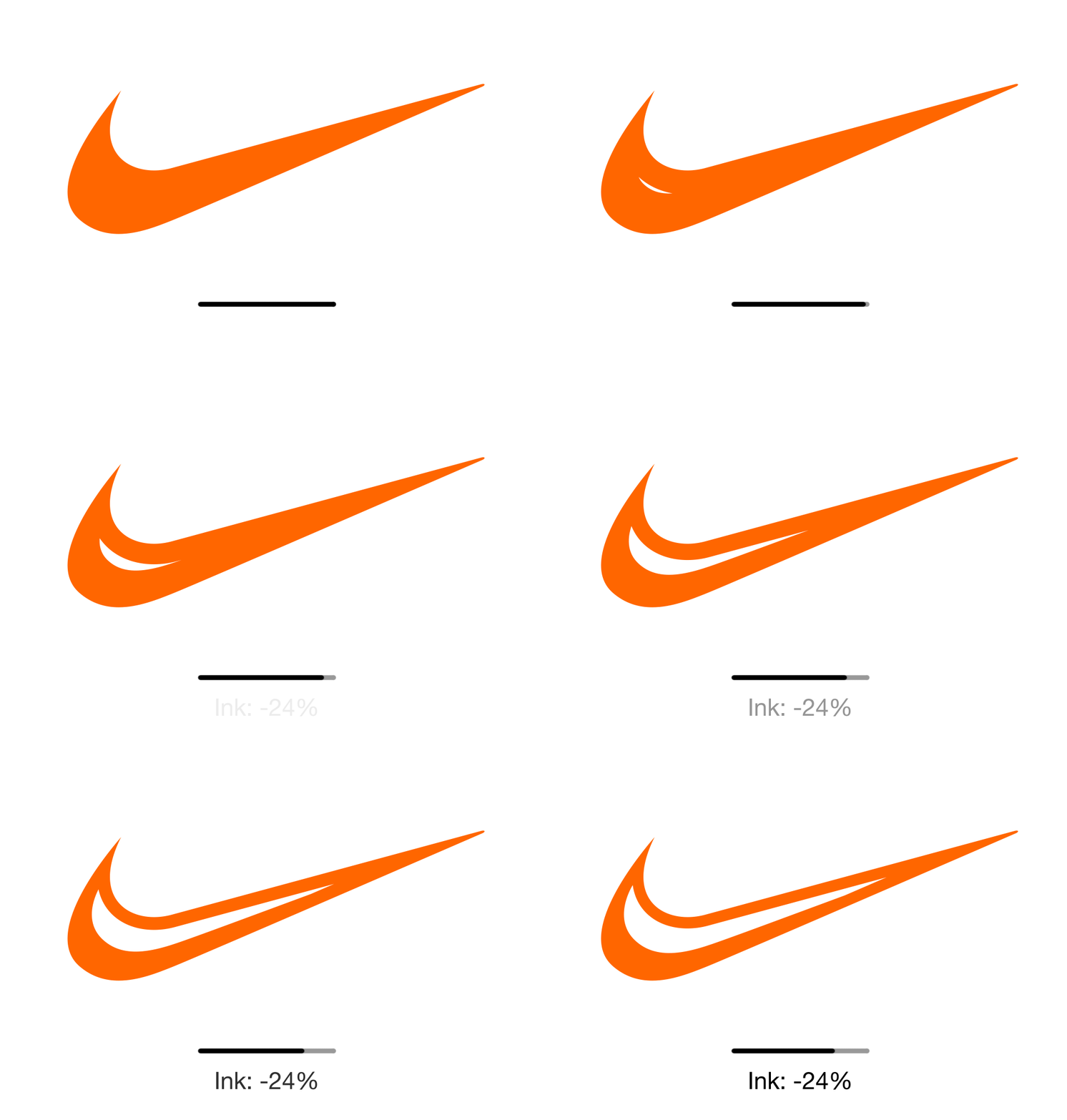
I was scrolling through my LinkedIn feed the other day when I stumbled across an article by The Think Tank which read: How can brands design more sustainable logos? What even is a sustainable logo? Eco Branding has the answers.

(Source: Eco Branding)
Created by Sylvain Boyer, a creative director at Interbrand Paris, Eco Branding is a project and initiative which aims to create more environmentally (and economically) friendly graphic and brand design.

Boyer founded the project back in 2013 with the intention of creating 'the first brand design agency dedicated to the ecological transformation of brands'.

While logos are just one part of Boyer's solution, Eco Branding have already started to edit existing company logos and ‘hollow out’ areas of solid colour, whilst maintaining the logo’s essence, which they claim results in 10-40% print cost savings without harming the integrity of the branding. The company points out, remarkably, that:

"Printer ink costs two times as much as Chanel No. 5. Limiting the use of ink can save millions on global production."


To put it into perspective, a bottle of Chanel No. 5 will set you back at least £45 - and that's for a measly 35ml bottle.

To kickstart their project, Eco Branding have mocked up ‘ecological transformations’ of some of the world’s best-known brands, including Coca Cola, Starbucks and McDonalds. Each design shows how they can reduce carbon footprints and printing costs without losing the identity of their brand; the McDonald's iconic golden arches remain, just without the additional colour.

(Source: Eco Branding)
Though some have been quick to comment that the new, proposed logos aren't quite as visually appealing as the current logos, I personally think that any opportunity to save resources - and ultimately help the environment - should be grasped.

You can find out more about Eco Branding on their website.

Five for Friday

On
Friday, July 6, 2018
Welcome to a new monthly blog feature, five for Friday, showcasing brilliant design, thoughtful branding, and fascinating marketing campaigns.


1. Julius Sans One
It's a typeface I've often overlooked, but recently, I've fallen in love with Julius Sans One - it's the ideal combination of swirly and modern, perfect! See it on Google Fonts.


2. The Highland Remodel by Studio McGee
If you're ever looking for interior design inspiration, look no further than Studio McGee. Every project of theirs is beyond beautiful including one of their recent bathroom renovations in the Highland Remodel. I am absolutely head-over-heels in love with the overall look of this bathroom, from the oak french doors, to the clean chrome mirrors to the bold emerald walls.


3. Lush Goes Naked
Lush's latest campaign has everyone talking! Last month, the high-street, cruelty-free giant opened its first 'naked' store (i.e. a store where all products are sold without packaging) in Milan in a bid to tackle the growing plastic waste problem. In addition, to mark World Ocean's Day on June 8th, Lush also launched two new vegan-friendly products to raise awareness of ocean plastics: the Turtle Jelly Bomb and Turtle Immersion Jelly Bomb. Find out more in this article by Plant Based News.


4. Pink Gin
Make a product pink and it's instantly ten times more stunning. I love, love, love this pink gin designed by I Want for Wölffer Estate Gin so much that I am considering purchasing a bottle, and I'm not even a gin drinker!


5. Floral prints by Lucy Auge
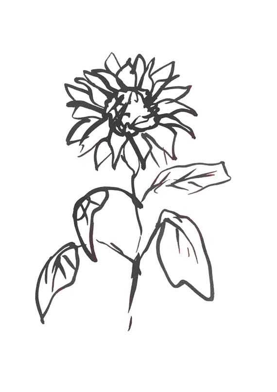
Lucy Auge's floral illustrations have been featured on my Pinterest board for a while now. Lucy, an artist based in the UK, creates her floral illustrations using black ink and a Chinese fat brush. Her prints are truly gorgeous and I hope to eventually purchase some to display in our home. You can shop her prints in her Etsy shop.

Spotlight on: Etta + Billie

On
Wednesday, June 27, 2018


Nestled in the Bayview district of San Francisco is Etta + Billie, a skincare brand founded on the values of family, community and sustainability.

Launched in 2009 by herbalist Alana Rivera, Etta + Billie are a sustainable skincare brand on a mission to create farm-to-bottle skincare which celebrates the food culture of America’s hilly city. All of their products are produced in small batches, using organic, fairtrade and natural essential oils and botanicals, and are packaged beautifully in simple yet sophisticated designs - a collaborative effort between Etta + Billie founder Alana and designer Molly Bellar, who comments:
“When we started working on the rebranded visual identity for Etta + Billie we knew that we had to be clear about how and what each product is made from. The core of the business is based around all natural, sustainable products – each different product relies heavily on the properties and effects that natural herbs have on the body and mind. We are so pleased that the packaging now reflects this.” 

Each Etta + Billie product, whether a bottled body wash or a boxed body scrub is encased in clean white Etta + Billie labels paired with bold typeface and an adorable red stamp, displaying the batch number. The packaging is understated, perfectly encompassing the natural qualities of Etta + Billie's products, and honouring the old craft of small-batch soap making. Molly continues:
“We took a simple, elegant and scientific approach. Each package shows off the unique qualities of the product and what the customer will gain from it. We chose to go black and white to further enhance the natural qualities of the product and always added a batch number to instil the fact that each bar of soap is handmade.” 

Etta + Billie products are produced by Alana in her San Francisco workshop but can be bought online at www.ettaandbillie.com

Images: Etta and Billie 
Quotes: The Die Line 

Spotlight on: Jeni's

On
Sunday, June 17, 2018


Thursday marked the Summer Solstice, or, the first day of summer. It only seemed apt to honour the day by shining a light on the official treat of summer and on one brand in particular who are paving the way in ice-cream packaging.

Founded in 2002, by celebrated, award-winning cookbook author Jeni Britton, Jeni's are an artisan American ice-cream company known for their creative flavours and high-quality ingredients. From it's first scoop shop in Columbus, Ohio, Jeni's has established itself as an ice-cream powerhouse, operating over 33 scoop shops in 10 American cities, and shipping to over 3,000 stores across America.

Back in October 2017, to celebrate their most popular flavours from the last 15 years, Jeni's redesigned seven of their classic pints, honouring them with vibrant new designs. Developed by Jeni's in-house art and design team, the colourful ice-cream pints feature new, two-tone colour palettes, unique handwritten scripts (a nod to the company's first pint packaging where each label was handwritten by a Jeni's member of staff), and exhibit the new Jeni's logo designed by illustrator Jessica Hische.

As Jeni herself comments in the company's unveiling blog post, the logo change sparked the redesign of the company's classic pints:

When we started our pint redesign almost a year ago we began with a logo refresh. I have always felt that our logo was lovely, similar to my own signature, but because of the “j” descender it never quite fit right on signage, packaging or T-shirts. The “j” was always so much bigger than the “eni’s.”
We are very happy with the result. It’s friendly and inviting, and retains all the character and soul of our old logo (in fact, I bet you didn’t even notice it changed), but turns up the energy by 1,000 percent. Our new logotype is now the showpiece of every pint.

The new logo design is incredibly subtle. In fact, there's very little difference between Jeni's old logo:


And the new:


The tangerine-orange adopted by Jeni's remains in the new logo, which is carried through to the pint designs (Salty Caramel bags Jeni's iconic orange colour), and the new logo is undoubtedly the focus of the new bold ice-cream pints, taking up almost one-third of the packaging design - a dramatic change from Jeni's first pint packaging where the logo could easily be overlooked.


Perhaps most importantly about the pint redesigns - and certainly my favourite aspect - is the stories featured on every pint, that provide details behind their many inspired flavours. For founder Jeni, the 
stories started with a simple but important question that she answers on the company’s blog: what sets Jeni's ice cream apart from the rest? “Every flavor we make tells a story,” Jeni answers. “Is inspired by art, culture, history. Takes hundreds of people working tirelessly to bring it to life—family-run dairies, farm partners, our R&D, sourcing, and creative teams. Our pints should capture and celebrate these stories.” She continues, “the instant you see our pints through a freezer, you should know it was made by Jeni’s and a little bit about what’s inside. Because let’s face it, what’s inside is still the most important thing.”