 |
| (Source: Eco Branding) |
Boyer founded the project back in 2013 with the intention of creating 'the first brand design agency dedicated to the ecological transformation of brands'.
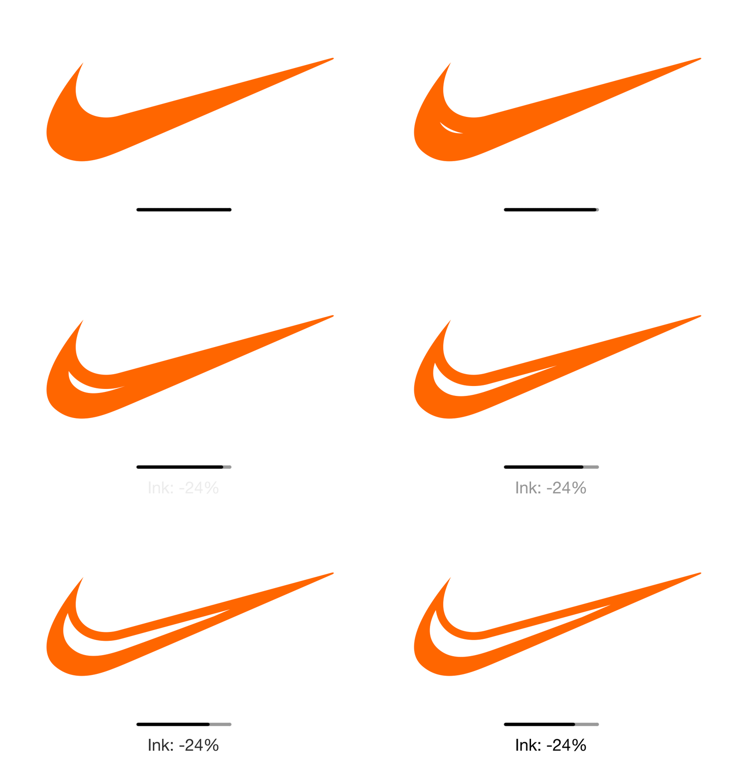
While logos are just one part of Boyer's solution, Eco Branding have already started to edit existing company logos and ‘hollow out’ areas of solid colour, whilst maintaining the logo’s essence, which they claim results in 10-40% print cost savings without harming the integrity of the branding. The company points out, remarkably, that:
"Printer ink costs two times as much as Chanel No. 5. Limiting the use of ink can save millions on global production."
To kickstart their project, Eco Branding have mocked up ‘ecological transformations’ of some of the world’s best-known brands, including Coca Cola, Starbucks and McDonalds. Each design shows how they can reduce carbon footprints and printing costs without losing the identity of their brand; the McDonald's iconic golden arches remain, just without the additional colour.
 |
| (Source: Eco Branding) |
You can find out more about Eco Branding on their website.


